Rebuilding the research foundation for FIC's website redesign

The Foundation for Intentional Community has connected people to communal living for over 35 years, yet its website had never been studied with the users it most needed to win over: newcomers. I led the research practice that gave the redesign its evidence.

Foundation for Intentional Community
Role

Lead UX Researcher, guiding a team of four

Client

Foundation for Intentional Community (via Tech Fleet)

Timeline

Oct 2024 to Sep 2025

Methods

Screener survey, discovery interviews, open card sorting, usability evaluation

Lead UX Researcher Discovery Card Sorting Usability Testing
TL;DR

No discovery research had ever been conducted on FIC's homepage. I led a screener-to-synthesis program: discovery interviews comparing the live site against the redesign prototype, followed by an open card sort across two personas. It surfaced why first-time visitors give up: conflated terminology, an unclear value proposition, and navigation built around insider language. The findings now anchor the homepage messaging, the 'Take a Quiz' onboarding strategy, and a restructured information architecture.

01
Context

A 35-year-old organization, redesigning blind

FIC's website is the front door to intentional community living: a directory of communities, courses, a bookstore, a forum, and a membership program. But the redesign underway had a gap. Discovery research had never been done on the homepage, so nobody knew what first-time visitors ('newbies') understood, expected, or needed when they landed.

Retention was the business problem. If a curious newcomer couldn't figure out what FIC offered on their first visit, they left. Our mandate was to understand the needs, goals, and motivations of newbie users, and to learn how they actually want to navigate the site, before the redesign hardened around assumptions.

02
Approach

From screener to synthesis, end to end

I designed the program as two connected studies sharing a single recruitment pipeline. A screener survey qualified participants by familiarity with intentional communities, then routed them into whichever study fit. The sequencing was deliberate: the interviews surfaced which labels failed users, and the card sort was built to answer exactly that.

01

Screener survey.

Recruited via social channels, qualifying participants on familiarity with and curiosity about intentional community living.

02

Discovery interviews.

Five moderated 30 to 45 minute sessions exploring first impressions of both the live site and the redesign prototype.

03

Open card sort.

Unmoderated sorts in UXTweak across two personas, 'newbies' and 'seekers,' with a follow-up survey probing their reasoning.

04

Synthesis & reporting.

Thematic analysis and category standardization, reported to the client and design team as decision-ready recommendations.

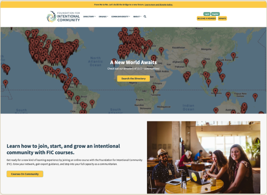
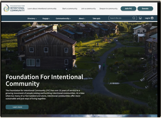
Live site vs. redesign prototype
Beforeic.org
FIC live homepage
AfterRedesign prototype
FIC redesign prototype
Figure 01. The comparative stimulus behind every session. Participants reacted to the live site and the redesign prototype side by side.
03
What we learned

Insider language was the biggest barrier for newcomers

Most

'Member' meant nothing, or three different things.

Most participants couldn't distinguish becoming an FIC member from joining a community. The site conflated joining the forum, supporting the nonprofit, and moving into a live-in community under one word.

All

Everyone gravitated to the quiz.

The 'Take a Quiz' button started as a late addition from the design team. In usability testing, every participant was curious about it and wanted to click it, seeing it as a way to narrow an unfamiliar world down to a starting point.

Several

Insider terms blocked exploration.

Terms like 'Communiversity' and even 'intentional community' stopped users cold. People hesitated to click menus they couldn't parse, so whole sections went unvisited.

Some

The live site was costing FIC trust.

Participants described the live homepage as unpolished and unclear about its purpose, not credible enough to donate to or explore. The prototype's progressive storytelling earned noticeably more trust.

Most

The directory raised more questions than it answered.

Filters were appreciated, but advanced search felt overwhelming, and location, the filter users cared most about, wasn't front and center.

"I'm really interested in taking this quiz. That will likely be my next step. I want to gauge myself and see if I'd be a good match for this."
Participant 5, discovery interview

The thread connecting every finding: newcomers arrive curious but unanchored. They don't yet know what they want, so they look for a beacon, an image that explains the mission, a quiz that gives direction, a definition that makes the unfamiliar familiar. Where the site provided one, they engaged. Where it assumed knowledge, they stalled.

04
Going deeper

Card sorting: letting users redraw the sitemap

The interviews told us the navigation's labels failed users; the card sort told us what should replace them. I ran an open, unmoderated card sort in UXTweak. Participants grouped the site's actual content, the directory, courses, podcast, membership, and forum, into categories of their own making, then named them.

We recruited two distinct groups to compare mental models: newbies, new to the concept entirely, and seekers, already considering community living. A follow-up survey asked why they grouped items as they did, turning a quantitative method into a qualitative one too.

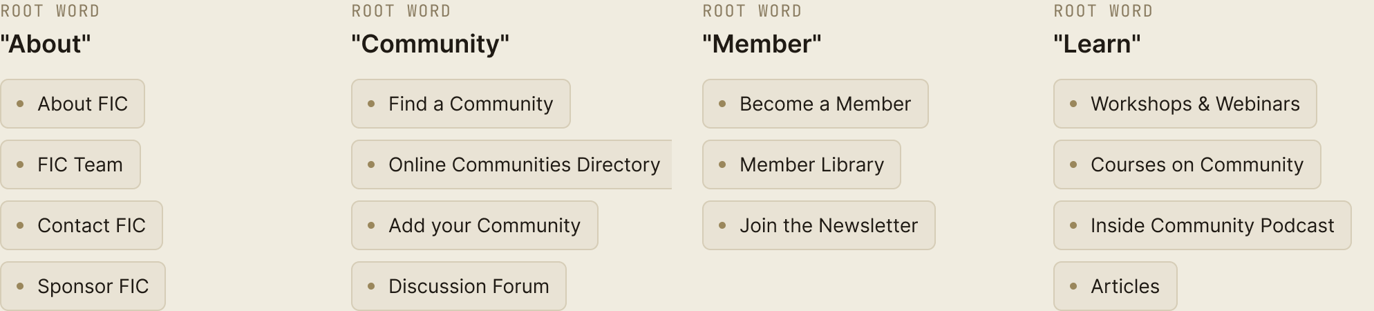
Open card sort — grouping pattern Open card sort results grouped under four root words — About, Community, Member, and Learn — each listing the site items participants sorted beneath it
Figure 02. Standardized categories from the sorts, translated into the candidate navigation the redesign adopted. Redrawn from the original analysis for legibility.

Standardizing categories across sorts revealed convergent structures we translated into candidate navigation schemes, anchored on a clear Directory, a plainspoken learning hub, engagement, and about, directly informing the redesign's information architecture.

05
Impact

Evidence the redesign could act on

The redesign hasn't shipped yet, so what follows are the recommendations the brief adopted.

Disambiguated the three 'joins.'

Distinct, benefit-led CTAs for the forum, FIC membership, and live-in communities, each with its own testimonial and imagery.

Elevated the quiz on the evidence.

Testing showed users were spontaneously drawn to the quiz, so we recommended promoting it from an experimental add-on into a primary onboarding and email-capture path for new visitors.

Replaced insider language.

Renamed 'Communiversity' and defined 'intentional community' progressively on the landing page, as the prototype proved effective.

Reframed trust as a design requirement.

Personal stories, impactful first imagery, and a polished layout became explicit redesign criteria.

Set the next research agenda.

Directory friction earned its own follow-up study, and the card sort created the baseline for evaluative tree testing of the new IA.

06
Limitations

What this research can and can't tell you

A small sample, read as themes.

Five moderated sessions are enough to expose patterns like the membership confusion, but the 'most' and 'several' labels above are proportions of five people. We treated the findings as directional and wrote recommendations that hold up without precise counts.

Recruiting favored the already curious.

Both studies recruited through social channels and screened for curiosity about intentional community living, so the sample self-selected toward people willing to explore. Colder audiences may stall even earlier than our participants did.

The comparison tilted toward the prototype.

A polished prototype shown beside an aging live site starts with an advantage, so we read preference reactions as evidence of the right direction rather than proof of the final design.

No live behavior yet.

The redesign hasn't shipped, so every recommendation rests on moderated sessions and sort data rather than production analytics. The card sort gives the team a baseline for tree testing the new IA once it's built.

07
Reflection

What this project taught me

Comparative stimulus is cheap and powerful. Putting the live site and the prototype in the same session cost nothing extra, and turned opinions into directional evidence the design team could trust.

On a website built by passionate insiders, the researcher's job is to stay professionally naive. Every term the organization takes for granted is a hypothesis until a newcomer says it back correctly.

It also reinforced the value of getting research in early, shaping the design brief before it hardens rather than validating decisions after they're made.

Read another case study